Dear decentralized justice enthusiasts,
The aim of the registry is to curate legit tokens with proper names and symbols. We need symbols to use them as icons, not high resolution, pixel-perfect images. But with the current rules of T2CR, many submissions got rejected because of tiny symbol imperfections. And this is not the aim of the registry.
That’s why I propose this ruleset for T2CR. The main change is relaxing symbol requirements.
Awaiting your input.
➤ All submissions must be tokens with smart contracts deployed on the Ethereum
(ETH) mainnet.
➤ The name should be the most commonly used name to refer to the asset. It does
not necessarily need to be the official name given by project creators nor the one in
the token contract. Suffixes such as, but not limited to: “Token”, “Coin” should generally be avoided, unless a name with suffix is already well established. Names should be treated like brand names (spelling wise). This means that the
correct spelling is dictated by the project owners, unless consensus forms around a
different spelling.
➤ Contract addresses are an attack vector and should be checked carefully.
➤ In case of duplicates, only the first submission should be accepted.
➤ Requests are not to be denied listing based on token creation date, token swap
status (with non-ethereum chains), use case or token activity.
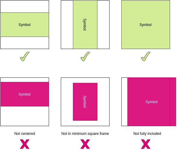
➤ Symbols should be fully included. They should be a transparent PNG of at least 128x128px and it should not be more than 1MB. They should be centered and be in a minimum square transparent frame so that the symbol barely fits inside. They should not include the project or token name unless the symbol always includes it.
Symbols are intended to be used as icons (at a maximum size of 128x128pxs), not meant to be displayed in high resolutions. They should be of a definition high enough such that image should not appear pixelated or blurry when displayed in 128x128pxs unless those are on-purpose features of the symbol or unless its the best image available.
Examples for Potential Disputes
- The symbol is looking sharp without any visible problems when displayed in icon size (128x128pxs) but there are some visual problems in the original resolution. - Accept Submission
- The symbol is looking centered when displayed in icon size (128x128pxs) but it’s not perfectly centered when displayed in original resolution. - Accept Submission
- The symbol looks like fitting in the minimum square frame when displayed in icon size (128x128pxs) but when displayed in original resolution there is a tiny space left. - Accept Submission
To summarize, unless visual problems are visible in icon size, disregard them.

